About this feature
This feature helps Imaging Operations teams to be data-driven in their approach to right-sizing appointment slots. By leveraging the Quantivly data layer, your team can create analyses and simulations to empower confident decisions and build consensus towards change.
Retrospective analysis of appointment slot sizes
Setting & filtering your analysis
By default, Slot Optimization charts a single protocol (the one with the highest projected time saved). The protocol list is sorted by impact by default (you can also sort it by exam volume or alphabetically), and you can select up to 5 to compare.
Click the settings icon to open the Settings panel.
Settings :
‘Buffer’ - In this data visualization, Buffer time gets added on to Exam duration. You can set it to ‘No buffer’ or use your preferred buffer time setting.
‘Group By’ - here, you can select the protocol naming field that should be used to group exams. Protocol Naming (RIS protocol, AI protocol, DCM protocol, etc.) options are customer-specific and depend on your Quantivly implementation.
‘Historical Data’ - Use this to set the date range for the past exams that you want to analyze: Last 90 days, Last 6 months, Last 12 months, or Custom range.
‘New Appointment Duration’ - The duration (in minutes) of a new patient appointment, used to convert minutes saved into new appointments. By default, it is set to 30 minutes.
‘Revenue per Appointment’ - This parameter is used to model the revenue of a given appointment slot duration change. By default, it is set to USD 1,000.00 per appointment. Read the ‘Simulating impact of potential changes’ section below for more details
‘Slot Granularity’ - The slot size your scheduling system supports (5, 10, 15 or 30 min). See ‘Refining your analysis’ below.
Looking for an overview of where your main opportunities are? Use Q-Lens, our AI data analysis interface, to prioritize the analysis. In addition, our Customer Experience team can work with you to identify opportunities for slot right-sizing, to improve utilization and on-time start of exams.
Filters :
Filter | Description |
|---|---|
|
|
Weekdays, Body Section, Sedation, Patient Class |
|
|
|
.png)

The visualization refreshes every time you change a parameter or filter
Note : in the charts, only exams that are linked to an appointment are plotted.
Breaking down data for each scanner
Below each plot, you will notice a butt on.
on.
Click on it to show a series of charts for each scanner, allowing for deeper analysis.
.png)
Investigating outliers
Click on any bar in the bar chart to display a table view of all exams contained in that bar.
.png)
‘See details’ will take you to the Examination Details page (in a new browser tab)
Simulating impact of potential changes
Choosing a new duration
Use the slider bar to select your desired appointment duration.
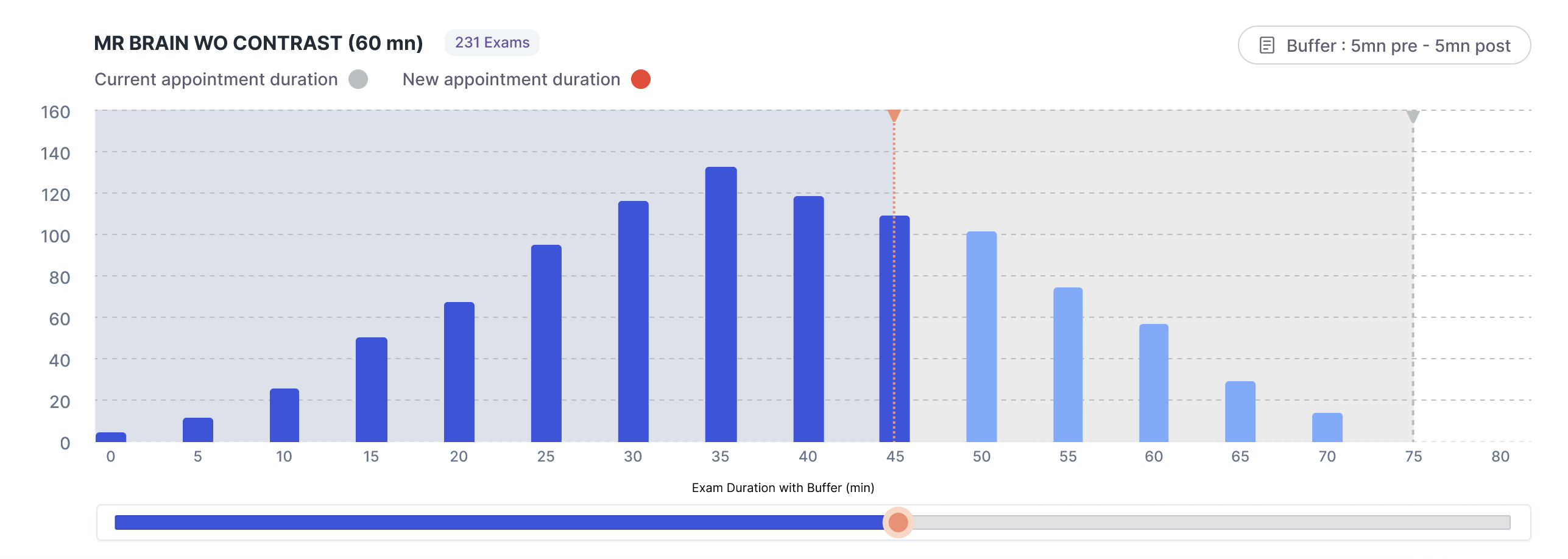
As you set a new duration, the ‘Projected Impact’ panel will update
Simulated variables
At the top of the screen, you will find the following panel:

Use the filter to define the time period on which the impact is simulated (weekly, monthly, annually)
Note that a month is 30 days
Simulated variable | Definition |
|---|---|
Interventions |
|
Minutes Saved |
|
New appointments |
|
Additional Revenue |
|
Risk of Overruns |
|
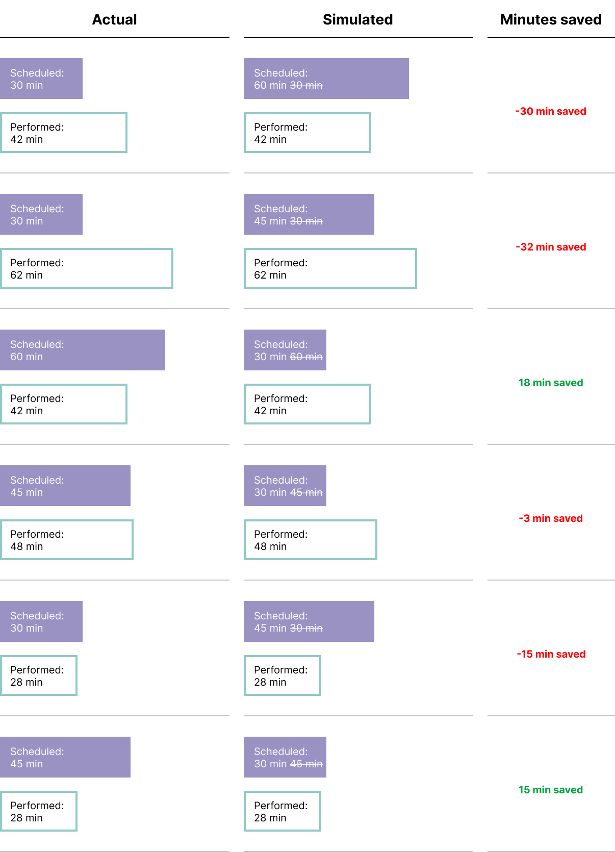

Saving a view
We recommend that you create a view to return to your analysis. Read this article for more information
Sharing & exporting the visualization
You can share a URL with other Quantivly users. Once they click it, they will see the same visualization that you are seeing.
Additionally, you can export a PDF document directly from the app.
Refining your analysis
A few controls help you focus the simulation:
Custom date range — under Historical Data (in the Settings panel), pick a preset (Last 90 days, Last 6 months, or Last 12 months) or choose Custom range to set your own start and end dates. The custom date picker also offers This fiscal year and Previous fiscal year, based on your organization’s fiscal year.
.png)
Sort by impact — sort the protocol list by Impact (scaled to the selected period, e.g. “Impact Monthly”) to surface the biggest opportunities first; the highest-impact protocol is pre-selected by default.
Slot granularity — set the slot size your scheduling system supports (5, 10, 15, or 30 min); the suggested slot and overall impact round up to it.
