About this feature
The Performance Metrics Dashboard gives users insights into scanner utilization, exam volumes, and schedule efficiency.
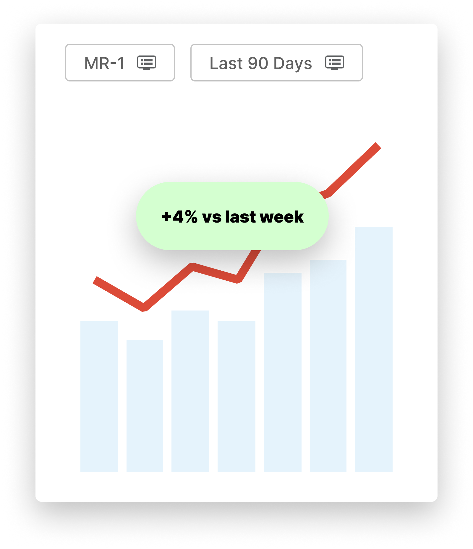
It provides a high-level view of utilization and how it evolves overtime.
Before you start
Requirements :
Platform requirements: 2.3.0
Availability : general availability
Permissions : all users
Additional requirements : requires HL7 integration (schedule data)
How to use the performance metrics dashboard
Access
The report can be found in Explore > Apps > Visualization > Performance Metrics Dashboard. It is available to all users in the organization.
Note : this dashboard may also be called ‘Performance Dashboard’ depending on your platform version
Tip
User inputs

Granularity
You can set time series to be grouped by Month or by Week.
Months are calendar months. Weeks are from Monday to Sunday. This dashboard doesn’t offer Daily Granularity
Scanners
You can filter the dashboard on a list of scanners, using the ‘Scanner(s)’ dropdown menu. By default, all scanners are selected
Sections
You can include/exclude any combination of sections (eg. ‘Body’, ‘Cardiac’, …). By default, all sections are included.
Note: Combo exams blocks will remain included if one of the section types is still selected.
Weekdays
You have the option to include/exclude any combination of weekdays. By default, all days of the week are included.”
Date
By default, the dashboard shows the last 6 months.
You can visualize any date range by using the date picker. Read this article for additional information.
Dashboard metrics and components
Metrics
The dashboard shows the following metrics :
Exam count
Schedule utilization
Room utilization
Snapshot
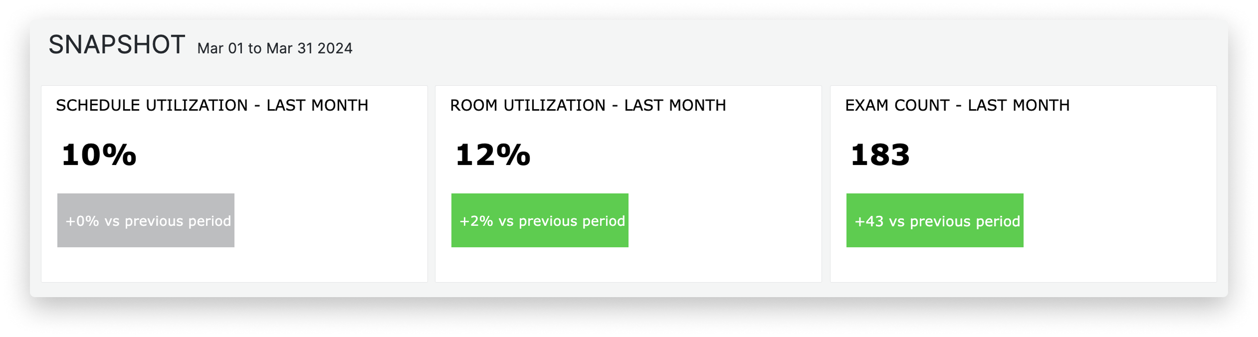
The snapshot section will show you key indicators on Schedule utilization , Room utilization and Exam Count, for your last complete period of time (week or month, depending on the granularity you have set), compared to the preceding period.
This is based on the date range you select in the date picker.
For example :
If you selected ‘April, 1st 2024 to July 31st 2024’, and set granularity to ‘Week’
Snapshot will show values for the last complete week ending in your selected time interval : July 22ns to July 28th 2024
Additionally, it will show variations comparing that week to the preceding week (July 15th to July 21st)
Note that if you select future dates, the snapshot will still show the last complete time period.
Overall
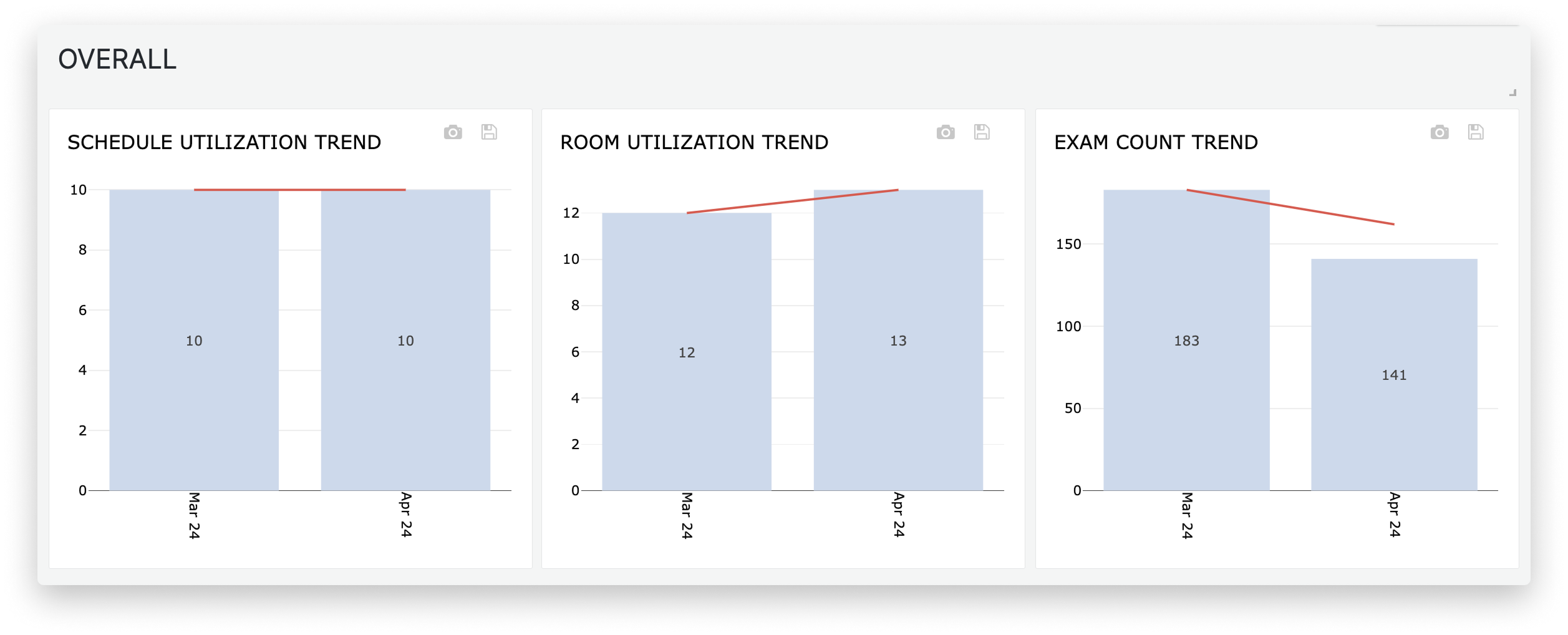 This chart shows 3 metrics and their evolution overtime :
The dashboard will display incomplete periods (e.g., partial months or weeks) if they are part of your selected date range.
Your choice of date range and filter settings (User inputs) impacts the data
The trend line is a 3-month moving average (current period + two preceding periods)
Sedation
This chart shows 3 metrics and their evolution overtime, broken down by ‘sedation’ attribute :
The dashboard will display incomplete periods (e.g., partial months or weeks) if they are part of your selected date range.
Your choice of date range and filter settings impacts the data
The trend line is a 3-month moving average (current period + two preceding periods)
See below for an explanation of how the figures are broken down
Patient class
This chart shows 3 metrics and their evolution overtime, broken down by ‘patient class’ attribute :
The dashboard will display incomplete periods (e.g., partial months or weeks) if they are part of your selected date range.
Your choice of date range and filter settings impacts the data
The trend line is a 3-month moving average (current period + two preceding periods)
See below an explanation of how figure are broken down
Supervision
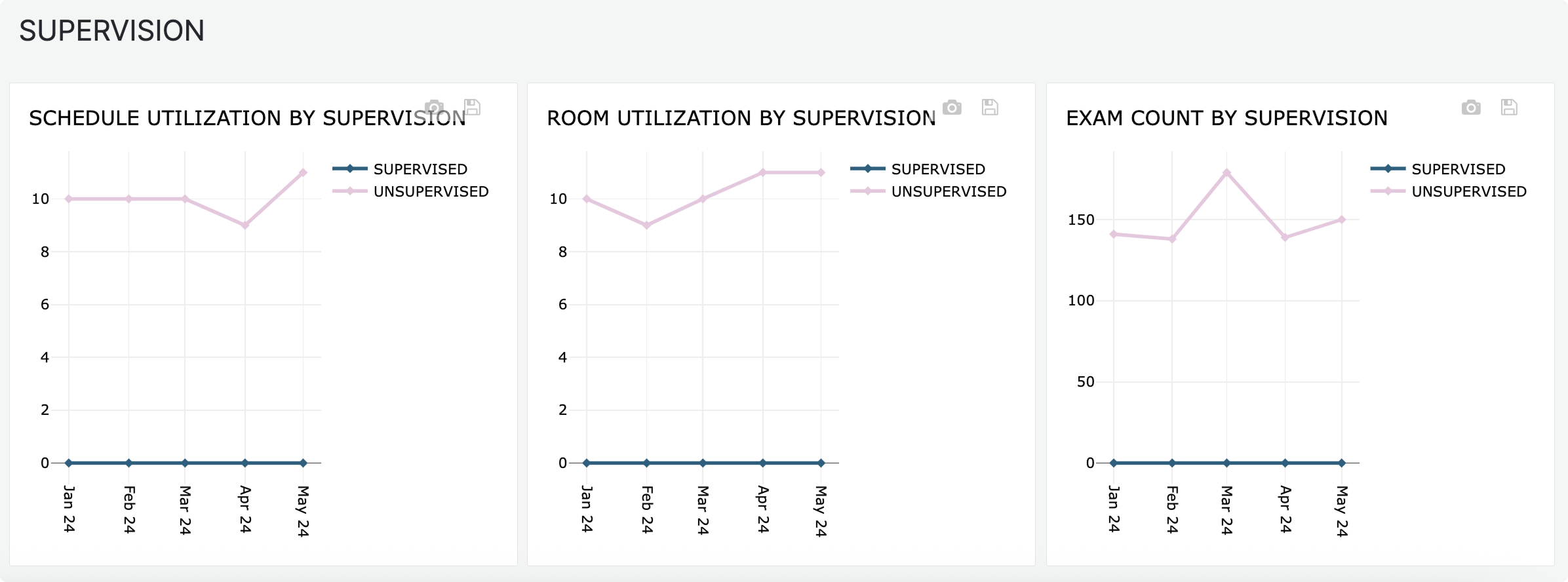
Note : this is made visible upon request to our Customer Experience team.
This chart shows 3 metrics and their evolution overtime, broken down by ‘supervised’ attribute :
The dashboard will display incomplete periods (e.g., partial months or weeks) if they are part of your selected date range.
Your choice of date range and filter settings impacts the data
The trend line is a 3-month moving average (current period + two preceding periods)
See below an explanation of how figure are broken down
Understanding how utilization % can be broken down by attributes
Schedule utilization and Room utilization are a time ratio, based on overall operating time / Operating Hours
Eg. Schedule Utilization = Total Appointment time / Total Operating time
Operating time is a value that cannot be broken down by attributes such as patient class, sedation or body section, as Operating Hours are not specifically allocated to a subset of patient class, sedation
For block time analysis, please contact your Customer Experience manager.
Therefore, utilization % values per attributes, such as sedation, should add up to the overall utilization % value.
These breakdowns give you a sense of how much sedation appointments contribute to your overall utilization.
Example : 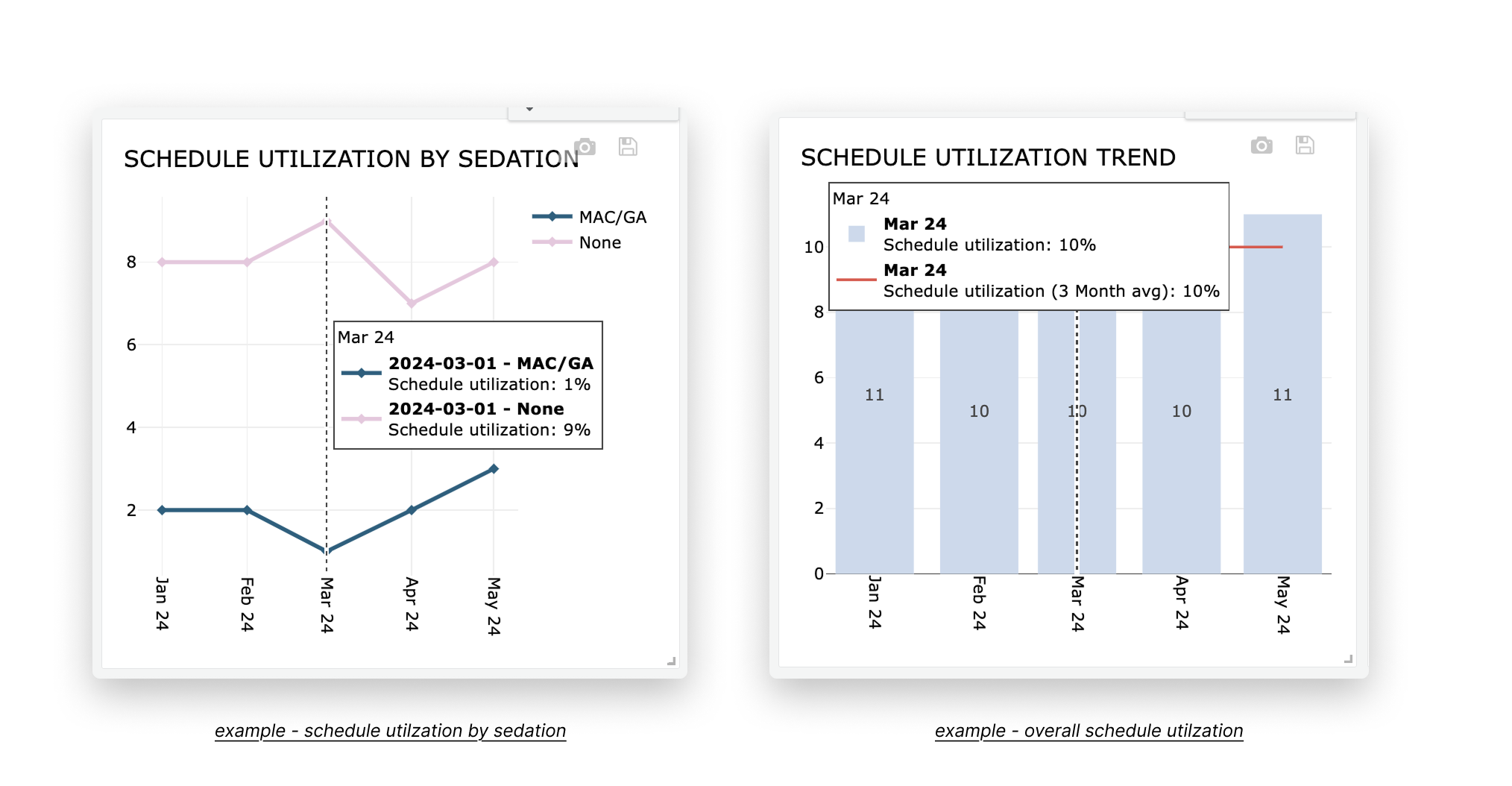
Schedule Utilization % for MAC/GA : 9%
Schedule Utilization % for Non Sedate : 1%
Overall utilization % = 9% + 1% = 10%