Overview is the landing page for the questions you ask first: how volume is tracking against your annual goal, how utilization compares to your own best days, and where the gaps are. Open it from Overview in the left-hand navigation, directly below Home. To open Quantivly on Overview, set it as your Default landing page in Settings › General settings.
This page was introduced in v4.0.0 and is marked beta in the app.
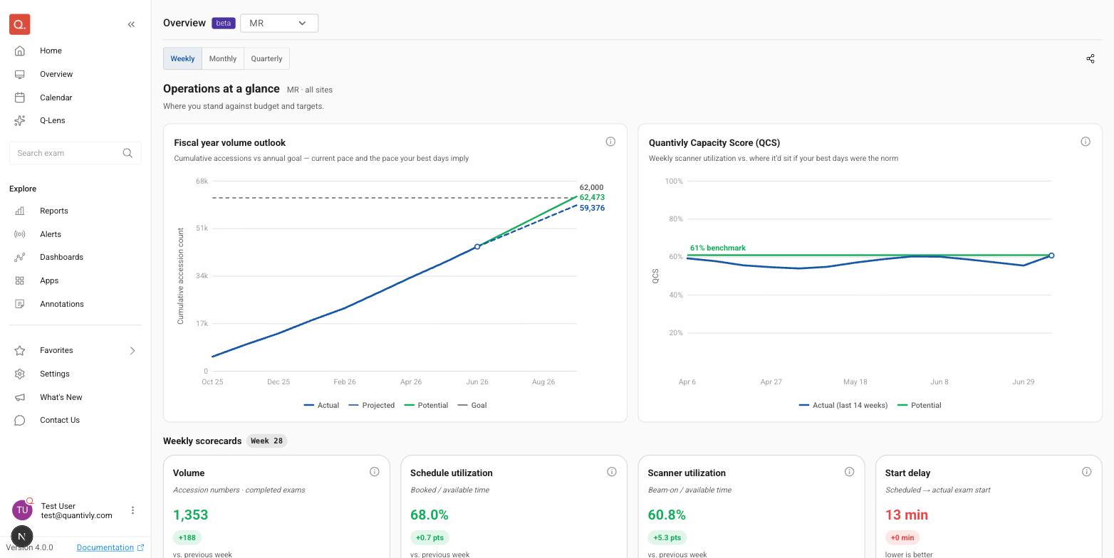
Scoping the page
Two controls set what the whole page shows.
Control | Where | Options |
|---|---|---|
Modality | Beside the page title | MR, CT, XR and PET. The ones you don't have are greyed out, with a Contact us button |
Period toggle | The row below the title | Weekly, Monthly, Quarterly |
This is the same modality picker the Calendar uses, so the two pages offer the same list.
Both controls are written into the page URL, so the share icon copies a link to the page exactly as you are looking at it — the person you send it to opens on the same modality and cadence.
Every card on this page covers all facilities. The scope line under "Operations at a glance" states this: it reads, for example, MR · all sites. There is no site filter on Overview; use the breakdown panel to compare facilities against each other.
Periods are counted in your deployment's timezone, not your computer's, so two people in different places see the same week.
Fiscal year volume outlook
Cumulative completed-exam accessions across the current fiscal year, drawn against your annual goal.
The goal line comes from the org-wide volume target for the selected modality. If no target is set for that modality, the chart still draws your cumulative actuals — it just has nothing to measure them against, and the subtitle drops the goal wording.
Projected (dashed) extends your current pace to the end of the fiscal year.
Potential is where the year would land if every scanner matched its own strongest days for the rest of the year. It can sit below Projected.
The fiscal year this chart uses is the one defined in Settings › Fiscal planning. Goals come from the volume targets on that same page. See Fiscal planning for both.
If your organization came on board part-way through a fiscal year and your Quantivly team has entered a Volume before Quantivly figure, the months before Quantivly had data are counted from that figure rather than as zero, so the projection is not dragged down by them. The chart's subtitle then says the figure was entered rather than measured.
One state worth recognizing:
"Fiscal year just started" — the outlook needs at least one closed month before it can draw a pace. It fills in as the year progresses.
Quantivly Capacity Score (QCS)
QCS tracks your scanner utilization each week against a simple benchmark: what that utilization would be if your best days were typical. The benchmark is set from your own performance — your strongest Mondays, your strongest Tuesdays, and so on, for each scanner — and treated as the target for every day of that weekday. The Potential line is where your utilization would sit if every day ran like your best ones; the Actual line is where you are now, week to week. It is the same score the Take the Pulse report shows.
Read it as two moves: close the gap to capture capacity you have already proven you can hit, and lift the benchmark to extend what "your best" means.
QCS is always weekly. It does not follow the Weekly / Monthly / Quarterly toggle, because the score is defined against a weekly benchmark — changing the cadence would change what the number means. The scorecards and the breakdown panel below do follow the toggle.
Scorecards
Four cards, each showing the current value, a sparkline, and the change against the previous period. The heading names the cadence you selected (for example "Weekly scorecards") and the chip beside it names the period the values are from.
Card | What it measures |
|---|---|
Volume | Accession numbers on completed exams in the period |
Schedule utilization | Booked appointment time as a share of available scanner time |
Scanner utilization | Beam-on (in-use) time as a share of available scanner time. The Grafana dashboards call this Room utilization |
Start delay | Minutes between an exam's scheduled start and when it actually began |
Start delay is a lower-is-better measure: its card still shows the change, but its caption reads "lower is better" instead of naming the previous period. Each card carries an info icon with the metric's definition.
Breakdown panel
A carousel of curated metric-and-dimension combinations, so you can see where an aggregate number is coming from. Volume by facility is always fiscal year to date; the other breakdowns follow the cadence selected with the Weekly / Monthly / Quarterly toggle.
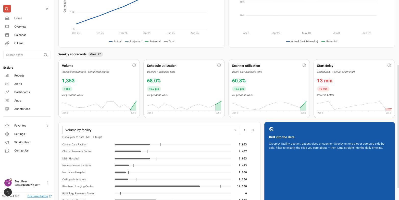
Breakdown | Reference |
|---|---|
Volume by facility | Each facility's own volume target, where one is set |
Start delay by patient class | None |
Average exam duration by sedation | None |
Average exam duration by patient class | None |
Scanner utilization by facility | Your best-days benchmark |
No row is scored pass or fail; the marks are there for comparison.
What is not here yet
The Drill into the data card describes grouping by facility, section, patient class or scanner and jumping into the daily timeline. It is marked Coming soon and is not clickable yet. To do that work today, use the Calendar.