About this feature
This dashboard presents statistics on report Turnaround Time (TAT) by radiologists.
Before you start
Requirements :
Platform requirements: 2.2.0
Availability : this dashboard is not available by default – please contact us to enable it
How to use the Turnaround Time Dashboard
Access
The report can be found in Explore > Apps > Visualization > TAT Dashboard. It is available to all users in the organization.
User Inputs

Granularity
You can set time series to be grouped by Month or by Week.
Months are calendar months. Weeks are from Monday to Sunday. This dashboard doesn’t offer Daily granularity
Scanners
You can filter the dashboard on a list of scanners, using the ‘Scanner(s)’ dropdown menu. By default, all scanners are selected
Section
You can include/exclude any combination of sections (Body, Cardiac, Fetal, MSK, Neuro, Other, Outside, QA ,Research, Vent Check. Default includes all sections.
Note: Combo exams blocks will remain included if one of the section types is still selected.
Weekday
You have the option to include/exclude any combination of weekdays. By default, all days of the week are included.
Date
By default, the dashboard shows the last 6 months.
You can visualize any date range by using the Date Picker
Metric definition
Please read the definition of Turnaround Time in our glossary.
Dashboard Components
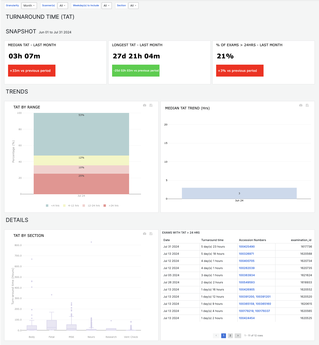
Snapshot
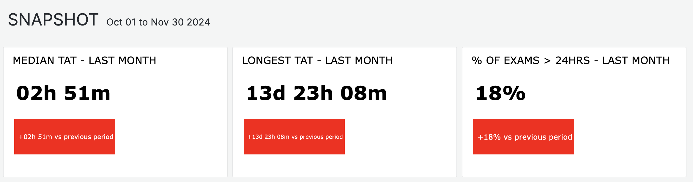
The snapshot section will show you key indicators on TAT, for your last complete period of time (week or month, depending on the granularity you have set, compared to the preceding period.
This is based on the date range you select in the date picker. For example:
If you selected ‘April, 1st 2024 to July 31st 2024’, and set granularity to ‘Week’
The snapshot will show values for the last complete week within your selected time interval: July 22nd to July 28th, 2024.
It will also show variations when comparing that week to the preceding week (July 15th to July 21st).
Note that if you select future dates, the snapshot will still show the last complete time period.
Trends & Details
The dashboard will display incomplete periods (e.g., partial months or weeks) if included in your date range
This view is affected by your selected date range and filter settings. (See User Inputs for more info)
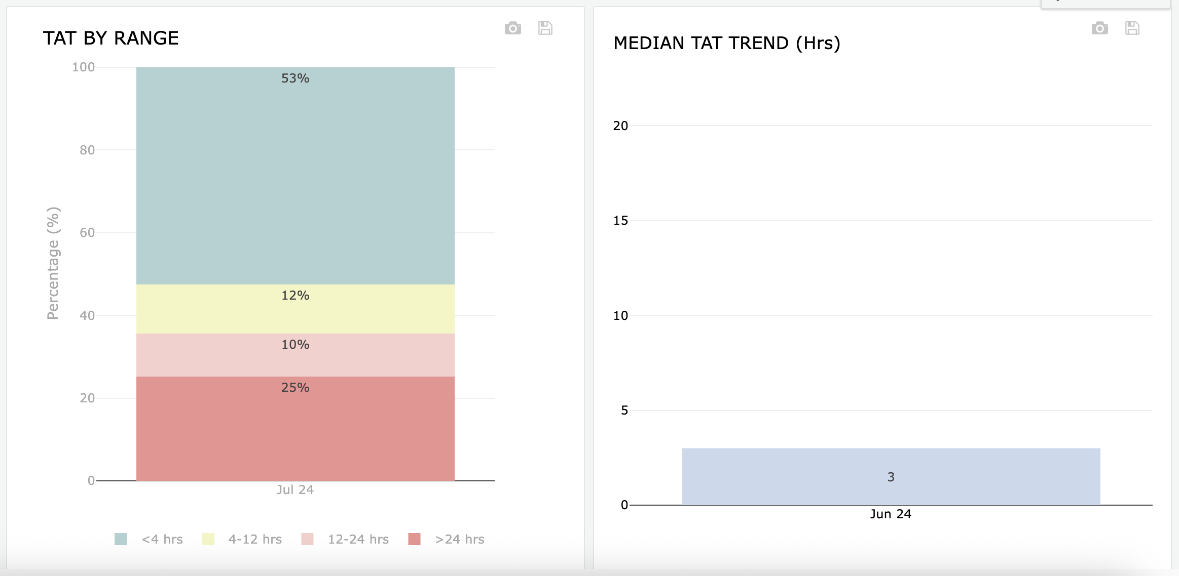
TAT By Range
Represents the distribution (in % of exam count) of exams, grouped by TAT range
Median TAT Trends
The Bar chart represents the median TAT for the period, in hours
The red trend line represents a 3-period moving average (average of medians – counting period N, N-1, N-2)
Period depends on User Inputs)
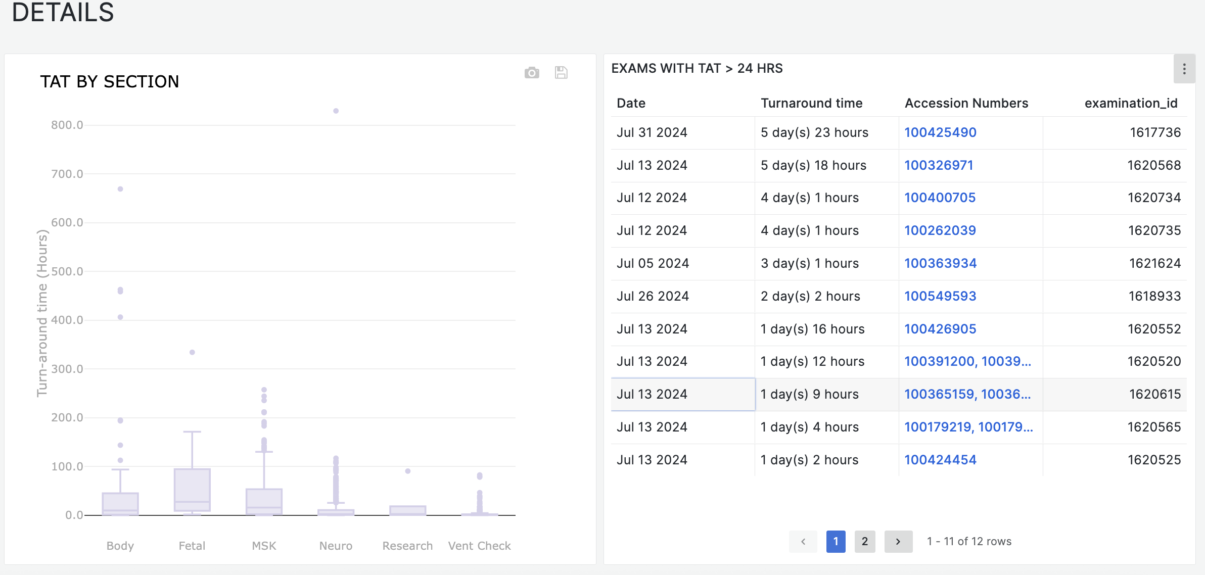
TAT By Section
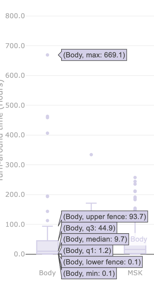
A box and whisker plot that represents TAT distribution (min, lower fence, lowest quartile, median, highest quartile, upper fence, max), in hours
Hover over plots to view statistical details
Exams With TAT > 24 Hours
This is a data table showing all exams where Turnaround Time exceeded 24 hours.. You can click each exam to review exam details in the Quantivly Hub (opens in a new tab)
Exporting Data
You can export data and charts from this dashboard. Read this article for more information.